
10 Neutral Color Palettes Perfect for Minimalist Brand Design
Minimalist brands thrive on simplicity, clarity, and timeless elegance — and your choice of colors plays a huge role in that perception. Neutral color palettes are the foundation of minimalism, offering versatility and sophistication that never go out of style.
In this guide, we’ll explore 10 neutral color palettes that can elevate your minimalist brand identity. These palettes work beautifully for branding, website design, packaging, and social media.
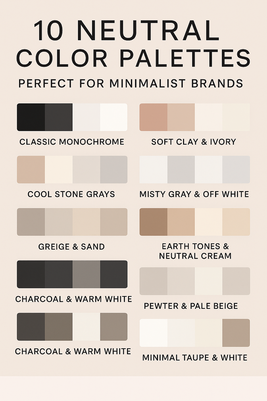
1. Classic Monochrome
- Colors: Charcoal (#333333), Black (#000000), White (#FFFFFF), Soft Gray (#EDEDED)
- Mood: Clean, timeless, and elegant
- Best For: Luxury fashion, design agencies, high-end tech
- Example Usage: See Apple’s design philosophy for inspiration.
2. Warm Beige & Ivory
- Colors: Warm Beige (#D9C7B0), Soft Ivory (#F8F5F0), Taupe (#B8A79C), Cream (#FFF9F4)
- Mood: Inviting, soft, and approachable
- Best For: Wellness brands, lifestyle blogs, organic products
3. Cool Stone Grays
- Colors: Light Stone (#E5E5E5), Medium Gray (#B1B1B1), Slate (#6F6F6F), White (#FFFFFF)
- Mood: Calm, structured, professional
- Best For: Architecture firms, tech startups, interior design
4. Greige & Sand
- Colors: Greige (#D5D0C5), Sand (#EADBC8), Stone (#B7AFA3), Off-White (#FAF8F6)
- Mood: Natural, balanced, earthy
- Best For: Eco-friendly brands, boutique coffee shops, slow fashion
5. Charcoal & Warm White
- Colors: Charcoal (#2E2E2E), Warm White (#F5F2ED), Pewter (#6B6B6B), Off Black (#1B1B1B)
- Mood: Minimal, bold, and refined
- Best For: High-end branding, minimal portfolio sites
6. Soft Clay & Ivory
- Colors: Soft Clay (#C7A693), Ivory (#F7F4F0), Light Mocha (#BFAAA0), Beige (#E9E2DB)
- Mood: Warm, artisanal, modern
- Best For: Handmade goods, pottery studios, artisanal food brands
7. Misty Gray & Off White
- Colors: Misty Gray (#C9C9C9), Off White (#FDFCFB), Ash (#9E9E9E), Soft Silver (#E2E2E2)
- Mood: Airy, fresh, light
- Best For: Skincare, wellness, minimalist e-commerce stores
8. Earth Tones & Neutral Cream
- Colors: Clay (#C4A484), Desert Sand (#E5C9B1), Neutral Cream (#F6F1EB), Warm Brown (#A58C77)
- Mood: Organic, grounded, sustainable
- Best For: Sustainable fashion, eco-packaging, organic markets
9. Pewter & Pale Beige
- Colors: Pewter (#8A8A8A), Pale Beige (#F3EDE6), Taupe (#C5BFB6), Warm Gray (#A5A5A5)
- Mood: Understated elegance, professionalism
- Best For: Financial services, modern real estate, corporate brands
10. Minimal Taupe & White
- Colors: Taupe (#B2A89C), White (#FFFFFF), Cream (#F9F8F6), Dust (#D3CDC4)
- Mood: Elegant, serene, and soft
- Best For: Interior design, photography studios, high-end lifestyle blogs
How to Choose Your Brand’s Neutral Palette
When selecting a palette, consider:
- Your target audience – Does the palette reflect their style and expectations?
- Brand personality – Are you going for warm and inviting or cool and professional?
- Consistency – Ensure your colors work well across web, print, and packaging.
If you need help creating a unique palette, check out this Adobe Color Tool to experiment with combinations.
Final Thoughts
Neutral palettes are more than “safe” — they’re timeless, adaptable, and convey a sense of calm sophistication. Whether you’re building a brand from scratch or refreshing your current identity, these 10 color palettes offer a starting point to create a lasting impression.
