
10 Example Shopify Stores with Clean & Modern Design (That Inspire & Convert)
.png)
A clean, modern design is more than just looks — it helps with clarity, trust, usability, and conversion. When visitors land on your store, you want them to feel confident, find what they need, and check out smoothly. Below are 10 Shopify stores that do this really well, with key design takeaways you can apply to your own store.
1. Allbirds
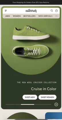
- What stands out: Minimal color palette, lots of white space, high-quality product shots.
- Why it works: The simplicity keeps attention on the product and sustainability story, without overwhelming the visitor.
- Design takeaway: Use consistent, soft backgrounds and highlight one or two focal visuals per section.
2. Houseplant
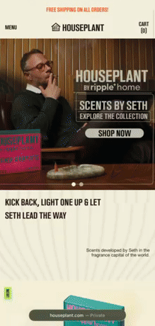
- What stands out: Contemporary minimalist look with unique touches — subtle color accents, clean typography.
- Why it works: It feels modern without being cold; the design reflects the brand personality.
- Design takeaway: Thoughtful use of accent color and type can lift a simple layout into brand identity.
3. Love Pop

- What stands out: Product-driven layout, clean sections with enough breathing room. They don’t overload with text; visuals lead.
- Why it works: Visitors can immediately scan and understand what’s offered. Clean layout increases focus.
- Design takeaway: Let product visuals do heavy lifting; minimal text helps.
4. Teddy Fresh
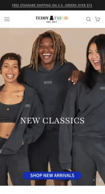
- What stands out: Clean design but with personality — vibrant color pops, playful type.
- Why it works: It balances modern minimalism with brand attitude; it doesn’t feel generic.
- Design takeaway: Don’t shy away from color or style—but use it strategically (e.g. CTAs or feature areas).
5. Tentree

- What stands out: Sustainability messaging, clean nature-inspired visuals, balanced layouts.
- Why it works: The design reinforces the brand promise (eco-friendly) which builds trust and coherence.
- Design takeaway: Align visuals and copy with your core values; consistency strengthens credibility.
6. Urbana Sacs

- What stands out: Subdued color scheme, focus on craftsmanship and subtle textures.
- Why it works: Gives a premium artisanal feel without sacrificing clarity or usability.
- Design takeaway: Texture, feel, and product story can add richness without clutter.
7. Harper Wilde
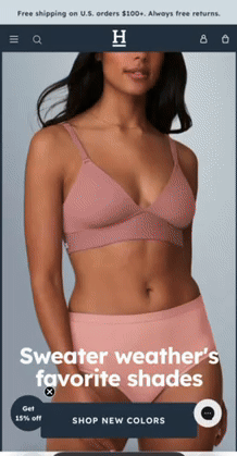
- What stands out: Simple layouts, strong use of negative space, very clean product and lifestyle imagery.
- Why it works: It allows visitors to focus on product features & benefit. Clean UI helps with trust.
- Design takeaway: Use white space and clean imagery to guide the eyes and reduce friction.
8. Studio Neat
.gif)
- What stands out: Tech accessories with clean design — crisp photos, minimalist icons, elegant typography.
- Why it works: It feels stylish and modern; product pages are easy to navigate.
- Design takeaway: For tech or modern lifestyle brands, sharp imagery + simple UI = perceived higher value.
9. Anker
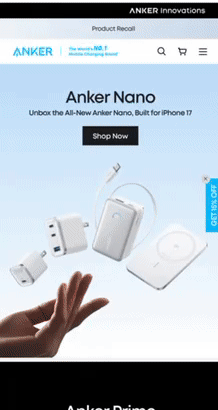
- What stands out: Functional, modern, uncluttered design; emphasis on product clarity.
- Why it works: Creates confidence in quality; visitors don’t get distracted by too many design gimmicks.
- Design takeaway: For performance/utility products, clarity and trust often matter more than flourishes.
10. Pangaia
.gif)
- What stands out: Strong branding with clean visuals, use of narrative sections, consistent styling.
- Why it works: They use design not just to sell but to tell a story—sustainability, materials, mission—all reflected visually.
- Design takeaway: Even with a modern clean layout, you can intersperse storytelling in between product sections to connect emotionally.
How to Apply These to Your Shopify Store
- Audit your current design — what feels cluttered, inconsistent, or off-brand?
- Choose or tweak your theme — pick a theme that supports clean layouts, flexible hero areas, good mobile UX.
- Refine your visuals — use good photos, minimize distractions, use consistent image styles.
- Streamline navigation and checkout — fewer clicks, obvious CTAs.
- Storytelling & brand identity — integrate mission, “why you exist,” sustainability or craftsmanship, etc.
Final Thoughts
These ten Shopify stores prove that clean and modern doesn’t mean boring. By pairing minimalism with personality, precision with clarity, and visuals with story, you can build a store that both looks great and converts well. If you use these examples as blueprints, you’ll be on track to build a store that customers trust—and want to buy from.
